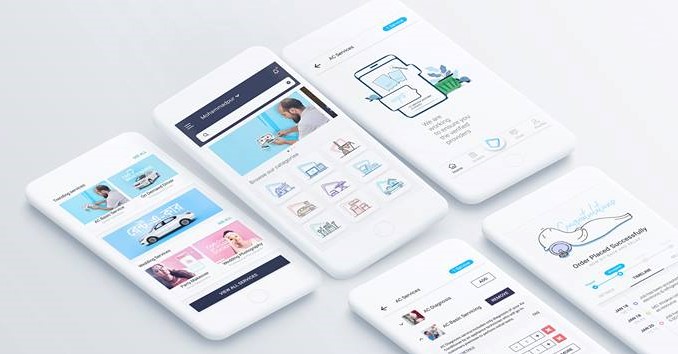
Sheba.xyz app – the onestop solution to everyday service needs has come up with a new solution to address to the daily life problems of their customers. With a new design interface and redesigned user flow – the app has become the simplest tool that can instantly respond to anyone in Dhaka need of a service.
The first version of the app was launched in 2015. The app did its first phase of the job very well – that is to help people search for and hire local professionals, and chose over 40 kinds of daily life services. The app also contained detailed information about the services and the service providers. Users were allowed to read profiles, and review and compare.
Based upon the older version of the app – the new Sheba.xyz app has been redesigned. Design components have been blended in both loud and subtle ways and Sheba.xyz app is on its way to become the one of its kind in Dhaka. The overall visual of the app is very clean to the observer’s eye given the plain white background, careful use of colors and minimal use of lines and elements.
In the home page of the app, you will now on find quirky terms such as Take Eat Easy or Pick My Laundry instead of previous direct serious terms. Each service line with its unique illustration that symbolizes the chain of services each can provide. The order button in the home page also allows you to clearly see the details of the orders you have just placed or had placed in the past.
In the new version, the service providers and partners have been displayed with their own logo to represent them as individual identity. The fact which confused many users before, that Sheba has its own service men have been clearly clarified in the new version. Sheba is basically a service marketplace, where many shops gather to deliver their service and the new app has positioned each shop with details, pricing and customer reviews.
The time slot in Sheba app has been divided more to make the slots more flexible. The interface comes with a smart clear concise instruction and less use of wordings or images.
The Deliver Address page is made easier for customer to save their address, name and phone number where they would frequently place order. This would save time and hassle for users from having to type and retype. The page also provides an option for you to select people from your phone directory directly instead of having to copy paste their name or numbers.
Finally, the checkout page is where you finalize and confirm your orders. The checkout page mainly summarizes the order placement to help you check and recheck if the services you asked for and the respective pricings are right, and also the information that you provided. You can also directly change any information from here and then finally complete the process by clicking the “Place Order” button.
The new version of the app has reduced the number of clicks it requires to place any order; detailed information is only displayed when the user asks for it. Find the people who love to serve – is the tagline of Sheba.xyz and using the new app you can very well see why. Find, people, love and service is the keyword of the Sheba.xyz and in the latest version of app you are about to see why.
The interface infrastructure has been changed to aid to the user’s visual comfort so that whoever uses the app does not just feel that a need has been met up but that a pleasurable experience has been gained each time the app pops open.


